Mapping Mangrove Growth and Deforestation with Satellite Imagery
Published:
For my final Metis data science boot camp project, I knew I wanted to get some experience using neural networks on image data. After going back and forth on all sorts of ideas (who doesn’t when they are trying to come up with an interesting, but do-able, project?), I ultimately landed on classifying mangrove forests using satellite imagery.
Mangrove Forests
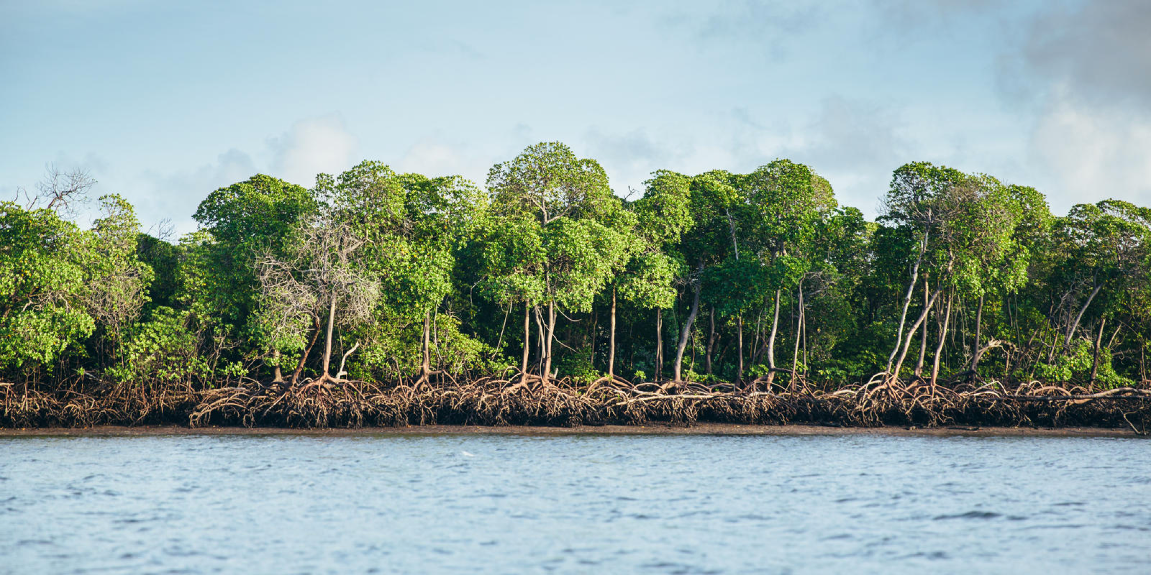
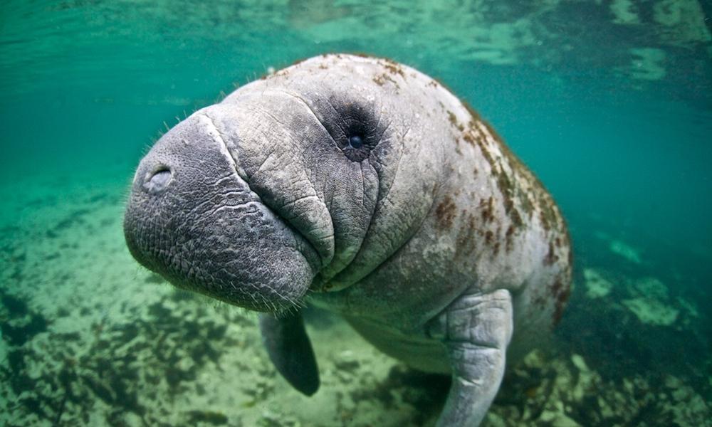
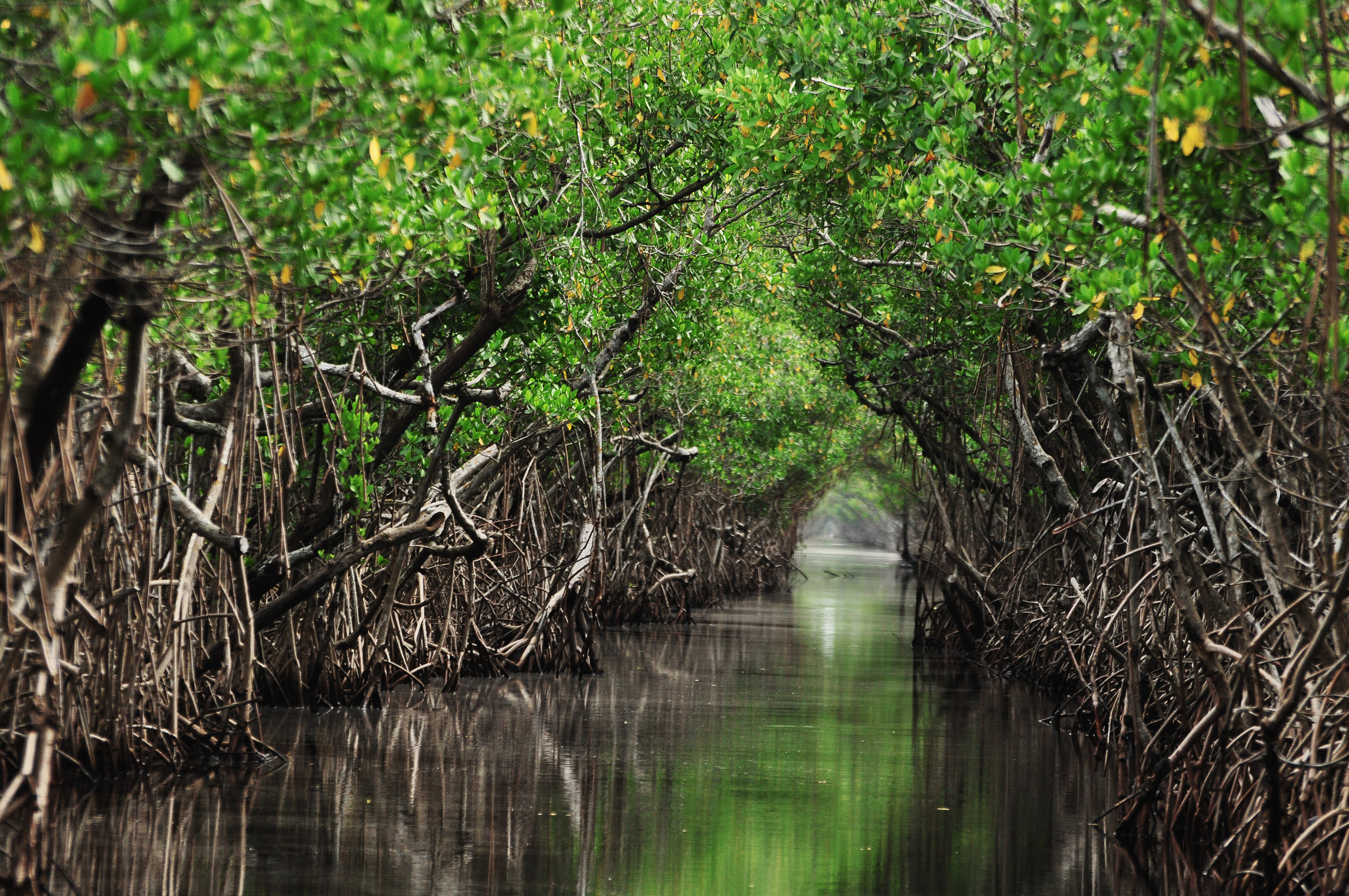
Mangroves are salt-tolerant, tropical trees which live and thrive along warm coastal waters. There are around 135,000 square kilometers of mangrove forested areas around the world. These mangrove forests store 4-10 times more carbon than ordinary land forests (per unit area), protect shorelines against storm surges, filter pollutants from the ocean waters, and provide natural habitats for many species (such as the manatee below). These mangrove domains are under threat from both long-term climate change effects and more immediate man-made sources. Per the Global Mangrove Alliance, these mangrove forests are being degraded at about 1% per year globally. In some cases, like the south of Florida or Myanmar, the degradation is even worse. Monitoring, tracking, and protecting these mangroves is a vital task for protecting our environment on both a global and a local scale.
Satellite Monitoring
Satellite imagery can be used for remote monitoring of mangroves worldwide. This approach has been used more and more in recent years, with many on-going advanced efforts. This article highlights several such efforts.
Google Earth Engine (GEE) is a powerful tool which allows free access to a wealth of satellite imagery. Given the time constraints (about 3 weeks) and having no prior knowledge of the subject or satellite data, this was a perfect resource for my project. GEE has a straightforward API for accessing said satellite imagery and outputting information and images of interest. Specifically, I was able to locate a map of mangrove forests for the world in the year 2000 developed by C. Giri et al. By using satellite images from the year 2000, and cross-referencing them with the mangrove map, I could train a classifier to recognize mangrove forested areas. I could then take satellite images from more recent years such as 2020, and apply my trained model in order to track the level of deforestation and growth.
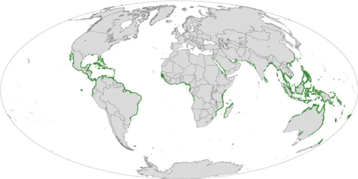
I decided to focus on one area of interest, that being the Florida coastline. There are over 60 mangrove species around the world with different physical characteristics. In my exploratory data analysis phase of the project I did test out including other locations such as places in Brazil and Cuba. In some instances the trained model performed well, while in some instances it did not. I decided to restrict my project to a single region where the satellite image colors were consistent, and my project could be more focused.
The Data
I started the project by learning how to use the GEE API along with a little bit of JavaScript along the way. The process is relatively simple: you load collections of satellite images, filter those images by time or location, composite several images together in order to create a single image, and lastly export that image to somewhere like Google Drive. (You can find here a very nice website which provides tutorials on how to get started. I found the section “Accessing Satellite Imagery” particularly helpful.)
From my research I knew that the labeled mangrove map was built on Landsat 5 satellite data. Because I wanted to compare classification results from year 2000 satellite imagery to year 2020 satellite imagery, I knew I needed data which was current. Landsat 5 was decommissioned in 2013, so I was left with either choosing Landsat 7 or Landsat 8 data. I chose Landsat 7 data, because it was active in the year 2000 and was still active in 2020. This gave me the ability to train a model using the same satellite system data as the data I would then later predict on.
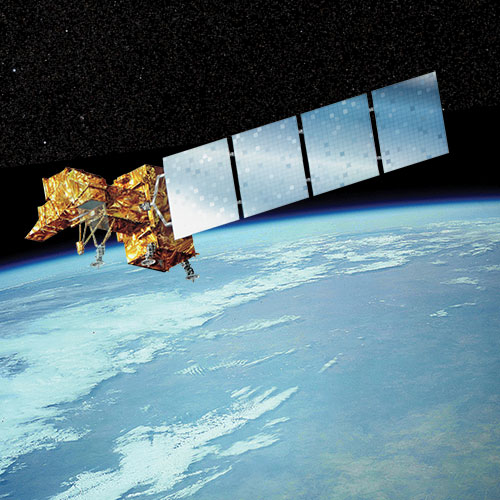
Landsat 7 data has a resolution of 30 meters per pixel, and contains information in 8 different bands. These are the standard RGB bands, a near infrared bed, 2 shortwave infrared bands, a thermal band, and a panchromatic band. (I decided to drop this last band since the resolution was 15 meters, and would complicate my analysis without adding much gain.) To be clear about my project now, I was going to do a pixel-wise classification of satellite imagery as mangrove forest or not, using these 7 bands as my features.
Satellite Image Compositing
Using a single satellite image by itself for the data would not work, as certain areas are captured only once every 8 to 16 days. Beyond that, in every image there will be clouds, cloud shadows, and potentially artifacts which obscure parts of the image. In order to get around this, GEE has some nice functionality to composite a single image from many other images based on various features. Using this functionality, I composited images from the whole year for the years 2000 and 2020, in order to mask out pixels which contained these clouds or artifacts.
But how to select which composited image each pixel should come from? If multiple satellite images contained the same pixel with no clouds in the way, then there is an issue of ambiguity. In the end, I selected the pixels which had the maximum NDVI values for each respective pixel. NDVI here stands for “normalized difference vegetation index,” and provides a standard measure for the amount of living green vegetation contained within a pixel. (Specifically NDVI is calculated from the near-infrared and red bands.) Selecting on the maximum NDVI satisfied a dual purpose, in that it also allowed me to select those pixels corresponding to mangrove forests at the height of the growth season, and account for changing seasons and conditions. (This approach is nicely suited for gathering images worldwide as well, though I only focused on one region of interest.) The image below shows an RGB image of a part of the Florida coastline, overlaid with the NDVI band colored as green, then overlaid with the labeled mangrove forests from the aforementioned map. As you can see, the darkest green parts of the image correspond directly with the labeled mangrove forests.

Models
For the classification model, I tested out two neural network models. I had a lot of help and took a lot of inspiration from two tutorials by P. Tripathy, here and here. They were a nice introduction to getting started with neural networks on satellite imagery.
The first model was a basic neural network with just two layers, and 14 nodes per layer. The input to this model was the information contained within a single pixel, ie. 7 numbers for the 7 different bands per pixel. This baseline model could almost certainly have been done with just a random forest classifier, but I wanted to get my feet wet with neural networks right off the bat, even if it was overkill.
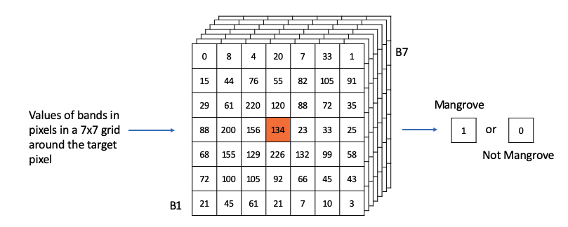
The second model was a convolutional neural network, taking as input the pixel information in a 7x7 grid around the target pixel. This would help with the classification of the pixel at the center of the grid. For the model architecture I started with the code as given in one of the above linked tutorials, and then tried out various alternatives to eke out a bit more precision and recall. I ultimately used two convolutional layers, several dropout layers, and a dense layer, as shown in the code block below. The dropout layers nicely prevented over-fitting, and no pooling layer was included because I was not trying to pick out a specific object from the image. (Since I’m still new to this, it may be true that pooling layers might still be useful for this use case.)
model = keras.Sequential()
model.add(Conv2D(32, kernel_size=3, padding='valid', activation='relu', input_shape=(7, 7, 7)))
model.add(Dropout(0.25))
model.add(Conv2D(48, kernel_size=3, padding='valid', activation='relu'))
model.add(Dropout(0.25))
model.add(Flatten())
model.add(Dense(64, activation='relu'))
model.add(Dropout(0.25))
model.add(Dense(2, activation='softmax'))

model.compile(optimizer= 'adam', loss='sparse_categorical_crossentropy', metrics=['accuracy', 'recall'])
Training and Testing
For training data I passed in over 3 million pixels from four separate wide-field satellite images of the Florida coastline in 2000 to the model. I then tested the model both on held-out pixels from those original images, as well as separate images entirely. I chose to optimize my model on F1 score, since I cared about both the precision and recall of the positive class equally. In the table below, you can see the F1 scores for the two different types of models, for the different pixel test data. As shown, the CNN outperformed the basic neural net anywhere from 1-4% depending on the data, and in general had an F1 score greater than 90% in all cases.
| F1 Scores | Basic NN | CNN |
|---|---|---|
| Test Data | 0.871 | 0.914 |
| Separate Image 1 | 0.911 | 0.921 |
| Separate Image 2 | 0.870 | 0.901 |
The CNN results for the two separate images that I tested on can be seen in the two images below. In these images, the color gold stands for those pixels which were accurately classified by the model as being mangroves, blue as those which were accurately classified as non-mangroves, and then green and red for false positive and false negative classifications respectively. You can see that in general the model does a pretty good job, though it isn’t perfect. One particular case where the model struggled was in inland areas where green land forests were misclassified as mangroves, or vice-versa with lighter colored mangroves.


Applied to 2020 Data
Once I had my model trained and tested on data from the year 2000, I was ready to apply it to the 2020 data. In doing so, I was able to track the change in mangrove forests over the last 20 years. The two images below show the applications of the model to the two Florida regions shown earlier, now for the year 2020. The colors green and red now indicate places of growth and loss of mangrove forests respectively, rather than false positives and false negatives. The first image in particular shows a drastic reduction in mangrove forests. The second image shows what looks to be growth further inland, so it’s not all doom and gloom. (It should be noted that there will be false positives and false negatives in these 2020 predictions, but they should in general be a fraction of the overall true change.)


Conclusions
In conclusion, I’ve trained a convolutional neural network on year 2000 satellite image data in order to classify pixels as mangroves or not-mangroves. I’ve applied this model to 2020 data in order to track changes in mangroves over the last 20 years for the Florida coastline. The gifs below show the overall process and results for two particular locations I’ve gone through in this blog post.


The approach detailed here can be a powerful tool to automate remote monitoring of these extraordinary and special habitats. Indeed there are groups who are working on this with far more advanced methods than what I’ve used here. Some particular articles and projects of note that I’ve run across (and learned a ton from) are:
- The Global Mangrove Watch web portal for tracking mangroves around the world
- The UK Hydrographic Office is doing machine learning with geo-generalizable models for various places around the globe
- The Forest Research Institute Malaysia is mapping mangroves in Malaysia
- GEEMMM: Google Earth Engine Mangrove Mapping Methodology project by T. Jones, funded by Blue Ventures Conservation
These are only a few of the resources out there and I’m sure I’ve missed some.
Future Work
If I had more time to work on this project there are a number of things I would do to improve things. To start, I would spend more time at the research phase of the project in order to better understand the overall landscape of the project material. From there, I would use other data to improve the quality of the original mangrove map and the input data to the model, such as elevation and higher quality satellite images. (I’ve noticed this is what some of the research groups listed above have done, among other things.) From there, I would want to try out using a more advanced classifier, such as a pre-trained U-Net, which from my understanding performs very well in cases such as this one. I was originally planning on doing this for the project, but never got around to it. Lastly, results from the classifier model could be combined with some type of recurrent neural network in order to create a powerful predictive model for future mangrove growth and loss. This is where the true power and use of such tools could really come into play. (Of course, there is no replacing the knowledge and insight of true experts in the field and on-location.)
If you have anything interesting to add, or just want to chat about the work I’ve done, please do not hesitate to contact me!

